OfferUp
OfferUp Feature Addition
Overview
For the third project we were grouped into teams of 3, our instructors chose the App. My teammates were: Jing assigned with Research, Yumi assigned with Interaction Design and myself assigned the title of Project Manager and our app assignment was OfferUp. Our task was improving an existing product/brand in order to solve a specific business problem.
We needed to deliver a project plan, project case study, documentation of user research, sketches and proof of the ideation process, proof of design iterations, user flows, sitemaps and an interactive prototype.
My Role
My role as project manager; timeline, information architecture, sketching, user research, paper prototype testing and overseeing prototype testing and iterations.
What is OfferUp
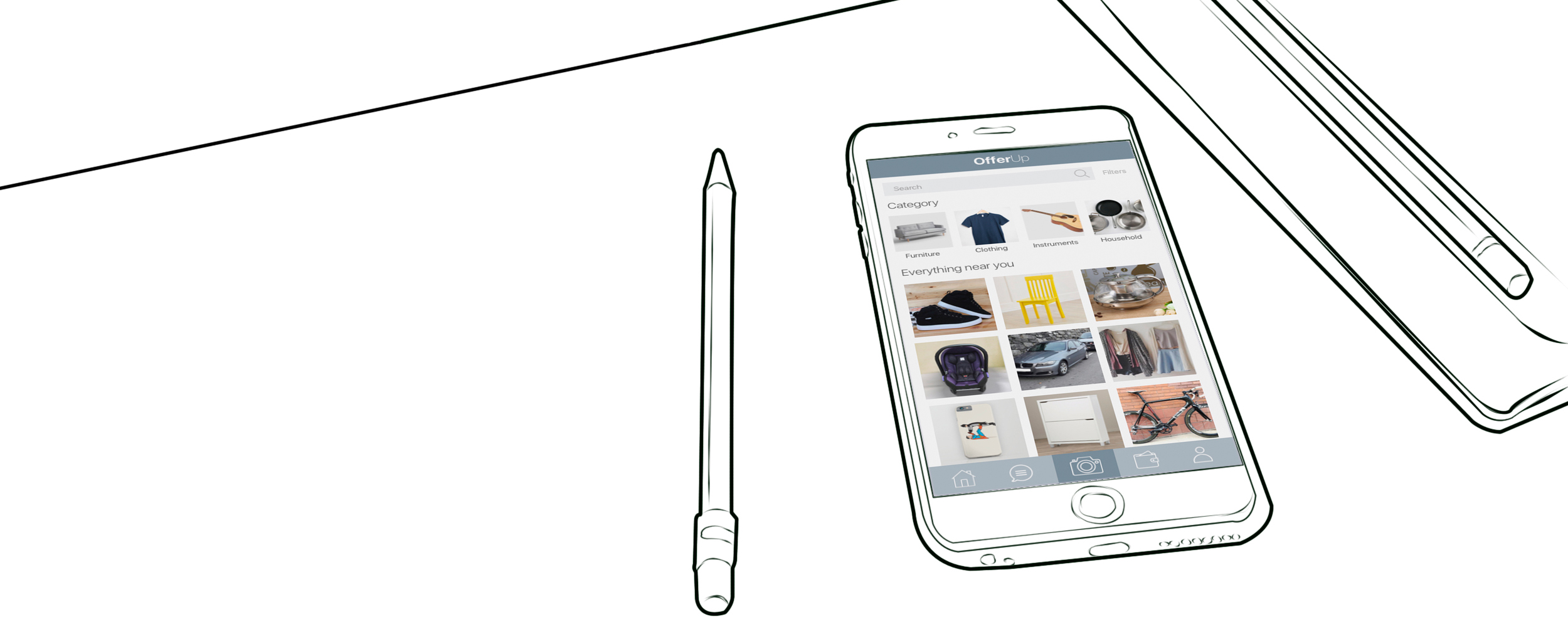
OfferUp is a classified style app, it's as though Instagram and Craigslist had a baby. Instead of buying from eBay, or scanning through Craigslist, OfferUp is a more local, more image-friendly mobile-only marketplace. Users get sucked in scrolling through all the photos like their Instagram feeds. You can even join TruYou by uploading a photo of your ID so you can be verified as a real human. Trust on OfferUp is key.
Timeline & Process
My main focus was to research immediately as well as synthesize and define so we could work on user interviews while simultaneously creating a comparative/ competitive analysis. My goal; compile user research, sketch a sitemap, create a persona, create 2 scenarios, create 2 userflows and make a paper prototype in 3 days. The main reason I wanted to do this was to test the prototype over the weekend so we could iterate and start wireframing the following week.
User Research
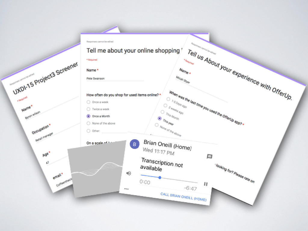
I put together a screener to find out who did and didn’t use the OfferUp app. We then made 2 surveys, one for people who used the OfferUp app and one for people who didn't use the App but had experience shopping online. We wanted to know what people liked and disliked about the OfferUp App and what they would change if they could. We also wanted to know what people liked and disliked about general online shopping and what they would want to have in a App. I conducted several interviews in the next couple of days in person and by phone to find out even more details. Each interview lasted about 10 to 15min depending on the amount of stories they had to share. What we learned from the research was that a number of interviewees complained about picture quality when selling items and not being able to edit photos in App. Another interesting trend was that most interviewees wanted to be able to review sellers and buyers, and even rate them if possible.
What I learned from the user research interviews ?
OfferUp Problems
OfferUp lacks in app photo editing.
Thumbnails are not consistent and confusing.
Setting a meet up in app is confusing, users cannot find the icon.
How to sell items is unclear
OfferUp solutions
Add a photo editing feature to the app.
Add consistency to the thumbnails.
Change the icon and create an overlay to let users know about the in app meet up.
Inform users know how to sell.
Our User Goals
To be able to post items quickly and easily.
Show clear prices and quality of items.
Edit photos in App.
Problem Statement
Buyers and sellers need to feel at ease when posting items online. People often can feel unsafe when buying and selling items to and from strangers. By giving users better photo editing options and a structured meet-up destination will help them feel more confident when buying or selling online.
Our next step was creating a Affinity Diagram together to find wants, needs and pain points to create our persona Timmy.
Sketching, SiteMap and Paper Prototype
Paper Prototype testing
The Tasks:
Go on and make an offer on a Fender guitar.
Look at your buying and selling listings.
Set a meet up with the seller.
Sell the Fender guitar.
Testing Results
Paper prototype results:
We brought back the home button: we thought at first the app didn’t need a home button but a back button instead, we were wrong. Testing showed users backing out of 4 or 5 screens just to reach the home page.
We removed the wallet button which was a price tag on the existing app. Testing the original design showed users not knowing what the price tag was for. We thought the wallet image would be easier for users to understand. Testing proved it didn’t matter, Users would click the profile icon to access their items, we ended up changing the button to a favorites.
We noticed it was still confusing for testers to set up a in app meet up. We needed to address this. Testers had no idea what it was and most didn’t even care, they thought it was unnecessary.
Bellow is our paper prototype to wireframe iterations:
Prototype Testing
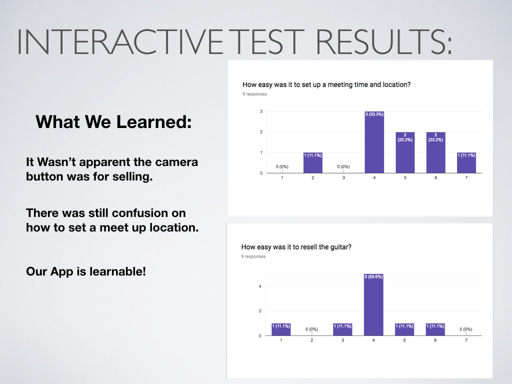
Yumi and Jing put together a working prototype in Invision. Jing then created a survey with the buying and selling scenarios to test people with. I hosted this mass testing event during one of our critique sessions, 9 people participated. Jing and Yumi walked around watching and taking notes on behavior. It was a great way to gather qualitative and quantitive data all at once. We then followed up with some 1 0n 1 testing as well.
What we learned from testing our prototype
We learned that testers were still confused on how to set a in app meet up.
Testers still didn’t know the camera button was for selling an item.
We needed to streamline the selling process.
Filter options were over complicated.
Our App is learnable!
Final Sitemap
Next Steps
We wanted to add some sort of event option, a way that users could organize and create places to sell their goods together much like a swap meet.
More iterations. A lot more can be done with this app to make the users feel more comfortable when using it.
Self Critique
If I had to do this again I would have made the roles more clear. The reason they weren’t clear is because we lost a day of work which made us share duties to catch up. I would have structured things differently for sure.
I learned how a project comes together and how long it takes for certain tasks to be completed. It was very hard, mostly because I have never done anything like this before and was learning as I went. I really liked the PM position, it felt like a good fit but I think in this next project I should try and do something different. That way I can still observe how projects come together in a professional setting while challenging myself with something i’ve never done before.


